GENOMICS ENGLAND

Interpretation Portal

Interpretation

Portal

Outcomes

Outcomes

Designed a component that was 42% smaller to improve the viewability and ease-of-the page


Created wireframes to help a user distinguish whether a medical case of was open or closed


Created a progress indicator component to notify the user that their data was being exported

Created a mobile version of the main app page to create a ubiquitous product


Ideated a new way for users to research with the goal of increasing engagement and utilisation


Created ways of working components in Figma to increase productivity within the design team

GENOMICS ENGLAND

Interpretation

Portal

Interpretation

Portal

Interpretation

Portal

Outcomes

Designed a component that was 42% smaller to improve the viewability and ease-of-the page


Created wireframes to help a user distinguish whether a medical case of was open or closed


Created a progress indicator component to notify the user that their data was being exported

Role

Role

Role

Visual & UX Design intern - Interaction Design, Visual Design, User flow.

Visual & UX Design intern - Interaction Design, Visual Design, User flow.

Visual & UX Design intern - Interaction Design, Visual Design, User flow.

Timeline

Timeline

Timeline

Aug 2022 to Dec 2022 to Sep 2023 - Designing and Testing

Aug 2022 to Dec 2022 to Sep 2023 - Designing and Testing

Aug 2022 to Dec 2022 to Sep 2023 - Designing and Testing

Team

Team

Team

User researcher, Service Designer, UX designers, Developers, Project Manager

User researcher, Service Designer, UX designers, Developers, Project Manager

User researcher, Service Designer, UX designers, Developers, Project Manager

PROJECT OVERVIEW

Helping clinical scientists interpret results

Helping clinical scientists interpret results

Helping clinical scientists interpret results

The first project that I worked on during my time at IBM was the Interpretation Portal for Cancer (IPC) for the client Genomics England. Genomics England is a medical company that deals with genomes from NHS patients with rare diseases and patients with Cancer. The IPC is a portal that helps clinical interpret genetic test results for users who are being tested for cancer markers.


The goal of the design team was to elevate the existing experience by addressing user problems and by refreshing the user interface. As a UX and visual design intern on the design team, I had the chance to work on many features, below are a few of my contributions.

PROJECT 1/3

Reduced Patient Header

Reduced Patient Header

Reduced Patient Header

Reduced Patient Header

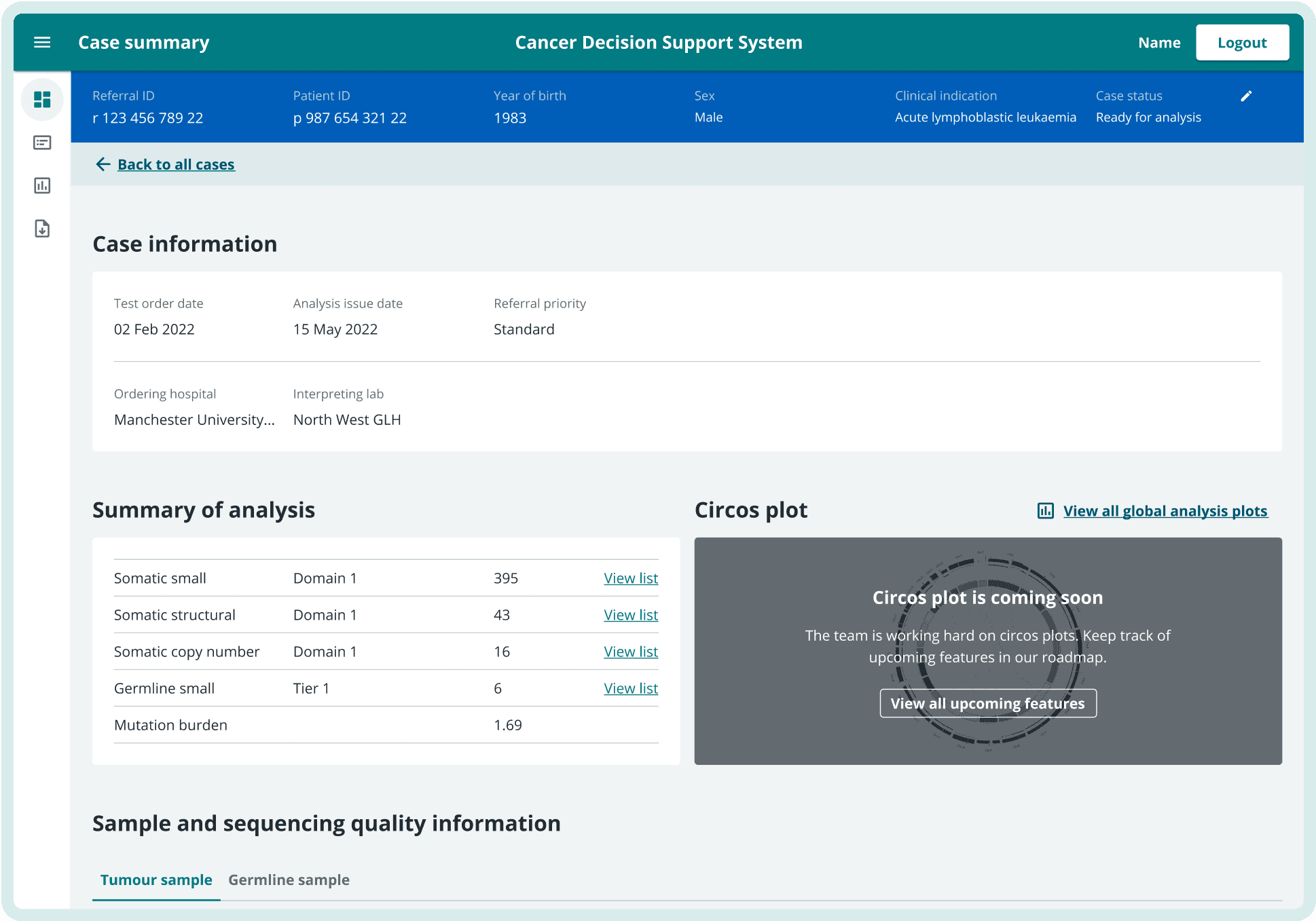
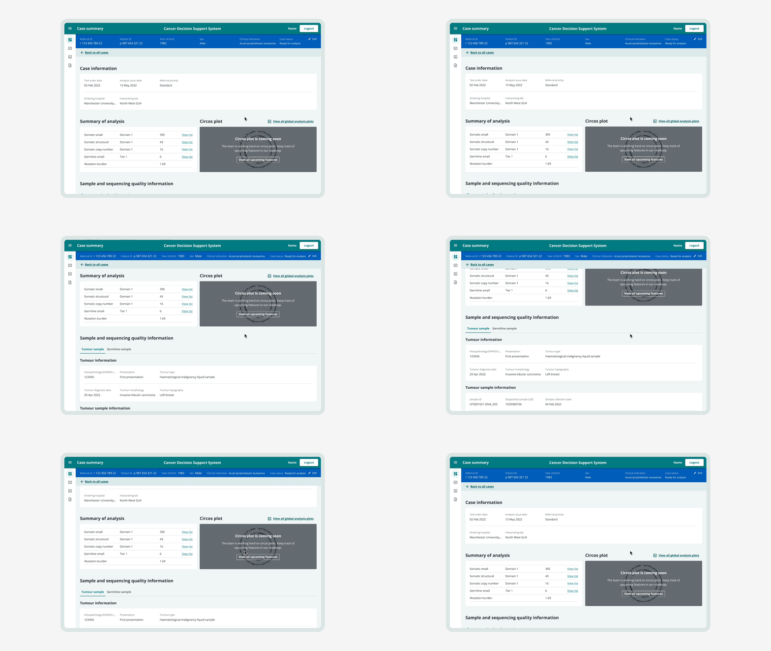
The blue patient header at the top of the page took up a lot of space, so I explored a header that was 42% shorter. This new header would appear as the user scrolled through the page and would appear when the user hit the top of the page

PROJECT 2/3

Closed Case

Closed Case

Closed Case

Closed Case

How do we let the scientists know that a patient’s case is closed? My solution was to change the colour of the patient header, disable the buttons, and add a banner at the top of the page

How do we let the scientists know that a patient’s case is closed? My solution was to change the colour of the patient header, disable the buttons, and add a banner at the top of the page

PROJECT 3/3

Exporting Progress Indicator

Exporting Progress Indicator

Exporting Progress Indicator

Exporting Progress Indicator

Genomic data is quite large, and it can take a while to export. So to notify the user that the data was being exported, I designed an indeterminate progress indicator.

Genomic data is quite large, and it can take a while to export. So to notify the user that the data was being exported, I designed an indeterminate progress indicator.

OUTCOMES

Delivering value to the team

Delivering value to the team

Delivering value to the team

Designed a component that was 42% smaller to improve the viewability and ease-of-the page


Created wireframes to help a user distinguish whether a medical case of was open or closed


Created a progress indicator component to notify the user that their data was being exported

OUTCOMES

Delivering value to the team

Designed a component that was 42% smaller to improve the viewability and ease-of-the page


Created wireframes to help a user distinguish whether a medical case of was open or closed


Created a progress indicator component to notify the user that their data was being exported

TAKEAWAYS

My first commercial project

My first commercial project

My first commercial project

I really enjoyed working on the Interpretation Portal for Cancer because It was my first major project and I was surrounded by so many designers and developers.


I learned to work on large features in fast-paced sprints and how to work with a design system. I also learned how to interact, communicate, and present my designs to project managers and clients.

TAKEAWAYS

My first commercial project

I really enjoyed working on the Interpretation Portal for Cancer because It was my first major project and I was surrounded by so many designers and developers.


I learned to work on large features in fast-paced sprints and how to work with a design system. I also learned how to interact, communicate, and present my designs to project managers and clients.